Professional Workspace: Clean HD Wallpapers to Boost Office Productivity
Your desktop wallpaper is the first thing you see every morning when you sit down to work. Most people treat it as decoration. I treat it as a productivity tool, and after years of writing from home offices, co-working spaces, and corporate environments, I’ve seen exactly how much a clean, well-chosen HD wallpaper changes the quality of a workday.
This article breaks down what makes a wallpaper productive, which categories work best for professional settings, and how to match your choice to your actual workflow.
Why Your Wallpaper Affects How You Work
The science here is straightforward. Visual clutter raises cognitive load. When your brain processes a messy, chaotic image in your peripheral vision, it burns small amounts of attention that should go toward your actual tasks. A clean, minimal wallpaper removes that drain.
Color psychology matters too. Blues and greens calm the nervous system and support focused, analytical thinking. Warm tones like amber and soft orange encourage creative energy. Stark white or light gray backgrounds create a clinical clarity that many writers and programmers prefer because everything on screen reads sharply against it.
I’m convinced that most people underestimate this effect because it’s gradual. You don’t feel distracted by a bad wallpaper in one sharp moment. The drain is slow, constant, and invisible until you swap it for something better and notice how much calmer your screen feels.
What Makes a Wallpaper “Professional”
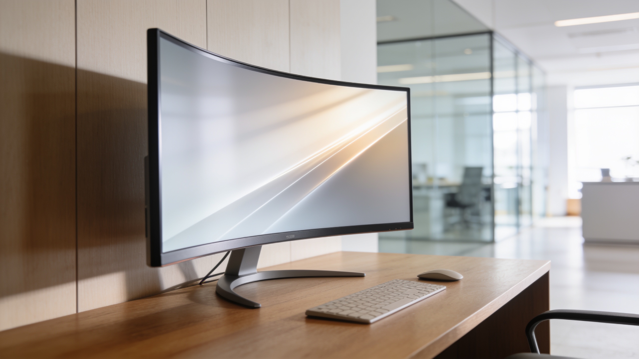
Professional wallpapers share a few defining qualities. They have low visual complexity, meaning the eye can rest on them without being pulled in multiple directions. They have enough contrast to make desktop icons readable without harsh borders around them. And they match the tone of the work being done.
A corporate finance analyst and a UX designer have different definitions of “clean.” The analyst probably wants something near-neutral, a muted gradient or an abstract geometric pattern in navy and slate. The designer might prefer a well-composed photograph with strong leading lines because it keeps visual instincts sharp without distracting from the actual design file on screen.
Resolution Matters More Than Most People Realize
HD here means at least 1920×1080. For anyone on a 4K or 5K monitor, that’s the floor, and it’s a low one. On a 27-inch 4K display, a 1080p wallpaper looks noticeably soft when you’re less than three feet from the screen. Always match your wallpaper resolution to your display’s native resolution or higher.
For dual-monitor setups, download wallpapers at your combined desktop width. A 5760×1080 image covering two 1080p monitors looks seamless. Tiling a single wallpaper across two monitors with different resolutions, particularly one portrait and one landscape, almost always looks awkward. Assign separate, coordinated wallpapers instead.
The Best Categories for Office Productivity
Here’s a breakdown of the main wallpaper categories, what they’re good for, and who benefits most from each.
| Category | Best For | Resolution Recommendation |
|---|---|---|
| Minimal gradients | Long focus sessions, writing, coding | 4K or native display resolution |
| Abstract geometry | Creative work, design, brainstorming | 4K, avoid overly busy patterns |
| Nature and landscapes | Stress reduction, remote workers | 4K wide-angle panoramas work well |
| Dark mode solid tones | Late-night work, eye comfort | Any resolution above 1080p |
| Typography and quotes | Motivation-driven environments | 1440p or higher for text clarity |
My personal preference for deep work is a minimal dark gradient, specifically a deep blue shifting to near-black. It pairs well with dark mode applications, reduces eye strain during long sessions, and keeps the screen feeling spacious even when I have multiple windows open.
Nature Wallpapers Done Right
Nature wallpapers earn a bad reputation in professional settings because of overuse. Stock sunsets and generic mountain photos feel tired. The ones that actually work are wide, calm, and low-contrast: a foggy forest floor, a still lake at dawn, an aerial view of geometric farmland.
These images work because they tap into attention restoration theory, the idea that soft, natural environments allow directed attention to recover. That’s why a 30-second glance at a calm nature wallpaper between tasks can genuinely refresh your focus. The key word is calm. High-energy nature images, crashing waves, lightning storms, dramatic waterfalls, produce the opposite effect.
Minimal Geometry and Abstract Patterns
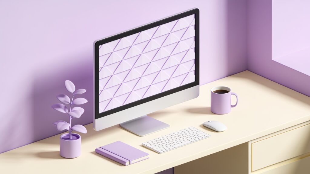
Clean geometric wallpapers thread the needle between visual interest and low distraction. A set of subtle hexagonal grids in charcoal and steel blue gives the eye something to rest on without demanding interpretation. The brain categorizes it quickly as “pattern, resolved” and moves on.
Avoid overly symmetrical, hypnotic patterns. Op-art-style designs that create depth illusions are exactly the wrong call for a monitor you stare at for eight hours.
Practical Tips for Setting Up Your Workspace Wallpaper
Follow these steps to get the most out of your wallpaper choice.
- Match the wallpaper’s dominant color to your application theme. Dark wallpaper with dark mode apps creates a coherent visual environment that reduces jarring contrast shifts.
- Rotate wallpapers on a weekly schedule. Novelty sustains mild engagement without tipping into distraction. Most operating systems have a built-in rotation feature.
- Test your wallpaper with your actual desktop layout before committing. Place your usual icons and widgets, then check readability and contrast from your normal viewing distance.
- Avoid busy wallpapers in video call setups. If your camera captures your monitor’s reflection, a complex wallpaper creates visual noise behind you.
- For shared office spaces, stay neutral. High-contrast or expressive wallpapers draw comments and questions that interrupt colleagues.
Choosing Based on Your Work Type
Focused, single-task work calls for the plainest options available. Solid dark colors, soft gradients, and minimal abstract textures all fit this need. Collaborative or creative work benefits from slightly warmer, more textured backgrounds that keep the creative side of the brain gently engaged.
If your job involves constant video calls, a clean medium-tone wallpaper reduces the contrast difference between your face and the screen environment, which makes the whole visual setup look more composed to the people on the other end.
Key Takeaways
Your wallpaper choice is a small decision with a daily dividend. A clean HD wallpaper at the correct resolution reduces visual noise, supports the color tone of your workflow, and makes your desktop feel organized before you’ve opened a single file.
Start with a minimal gradient in a color that matches your application theme. Test it for a full week before switching. You’ll notice the difference in your ability to settle into focus quickly, and that alone makes it worth the five minutes it takes to set up properly.
Browse the full library at hdwpro.com and filter by resolution and tone. Your ideal professional wallpaper is already there.